
Code Examples
Pie
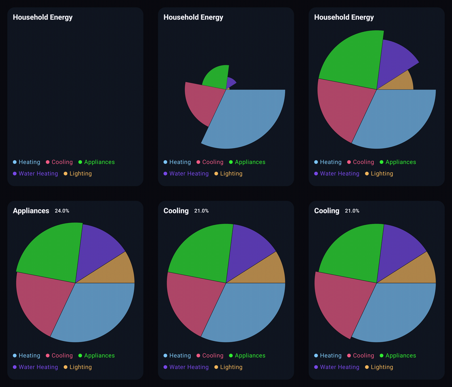
@Composable
private fun ShowPie() {
    val slices = listOf(
        PieSlice(label = "Heating", value = 32.0),
        PieSlice(label = "Cooling", value = 21.0),
        PieSlice(label = "Appliances", value = 24.0),
        PieSlice(label = "Water Heating", value = 14.0),
        PieSlice(label = "Lighting", value = 9.0),
    )

    PieChart(
        data = slices,
        title = "Household Energy",
    )
}
Line
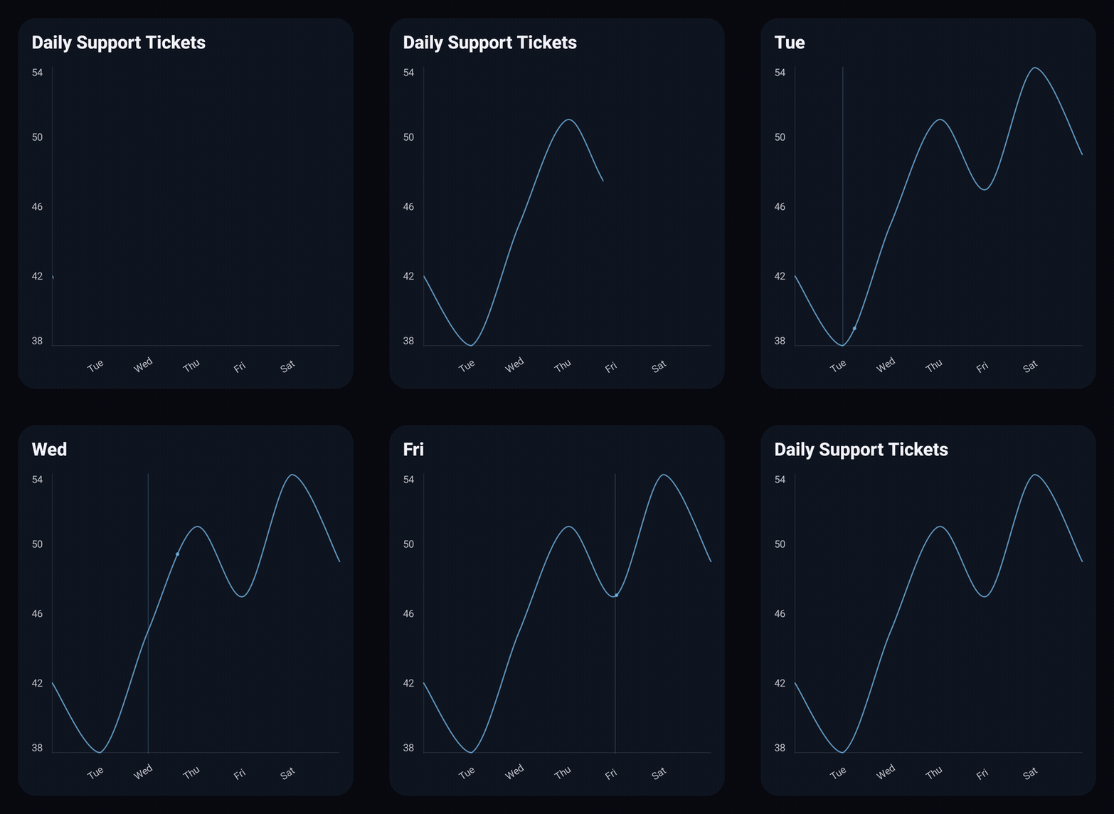
@Composable
private fun ShowLine() {
    val values = listOf(42.0, 38.0, 45.0, 51.0, 47.0, 54.0, 49.0)
    val labels = listOf("Mon", "Tue", "Wed", "Thu", "Fri", "Sat", "Sun")

    val data = values.toChartData(categories = labels)

    LineChart(data = data, title = "Daily Support Tickets")
}
MultiLine
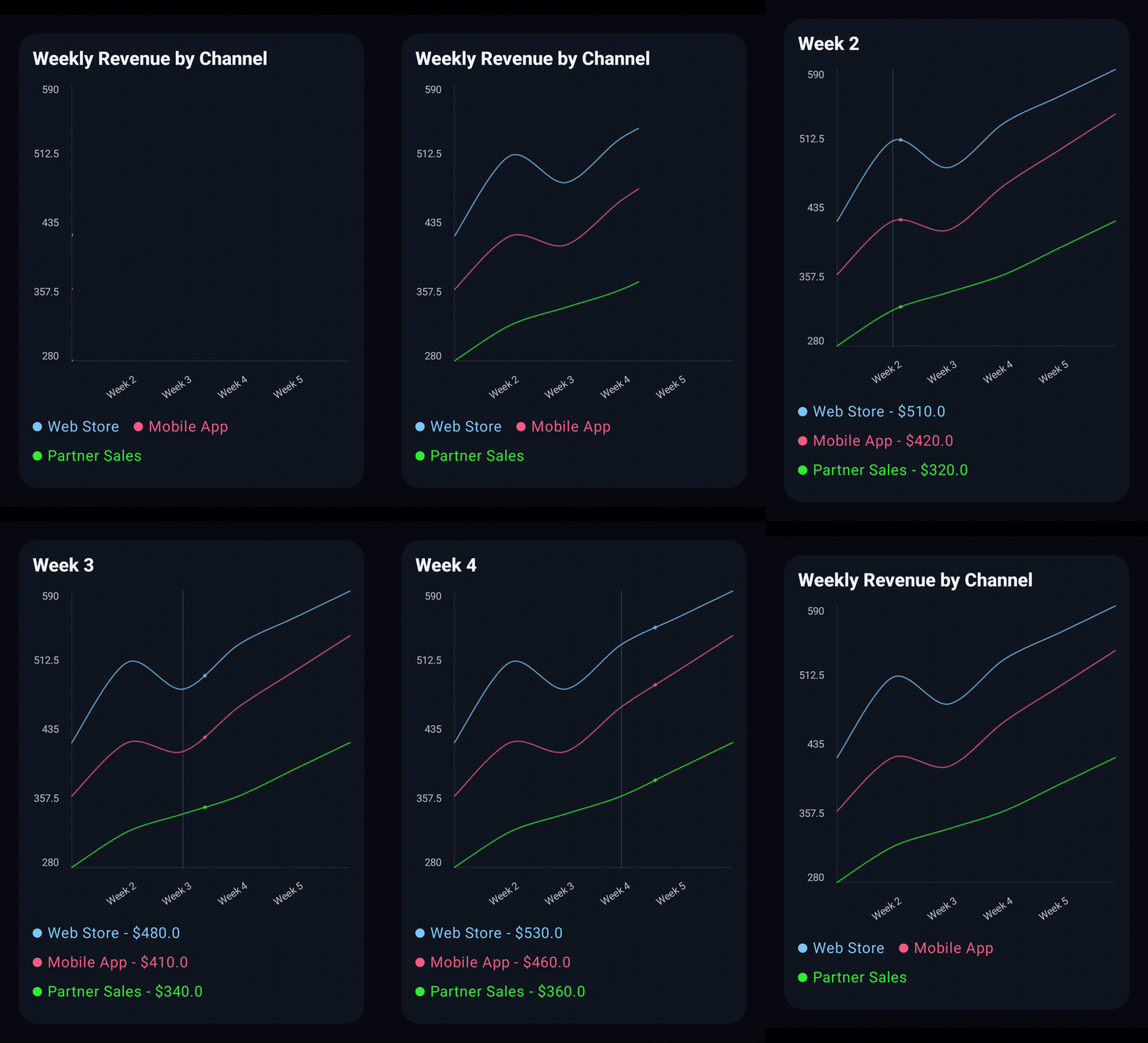
@Composable
private fun ShowMultiLine() {
    val categories = listOf("Week 1", "Week 2", "Week 3", "Week 4", "Week 5", "Week 6")

    val items = listOf(
        "Web Store" to listOf(420.0, 510.0, 480.0, 530.0, 560.0, 590.0),
        "Mobile App" to listOf(360.0, 420.0, 410.0, 460.0, 500.0, 540.0),
        "Partner Sales" to listOf(280.0, 320.0, 340.0, 360.0, 390.0, 420.0),
    )

    val data = items.toChartData(categories = categories)

    LineChart(
        data = data,
        title = "Weekly Revenue by Channel",
        valueFormatter = ChartValueFormatters.prefix("$"),
    )
}
Bar
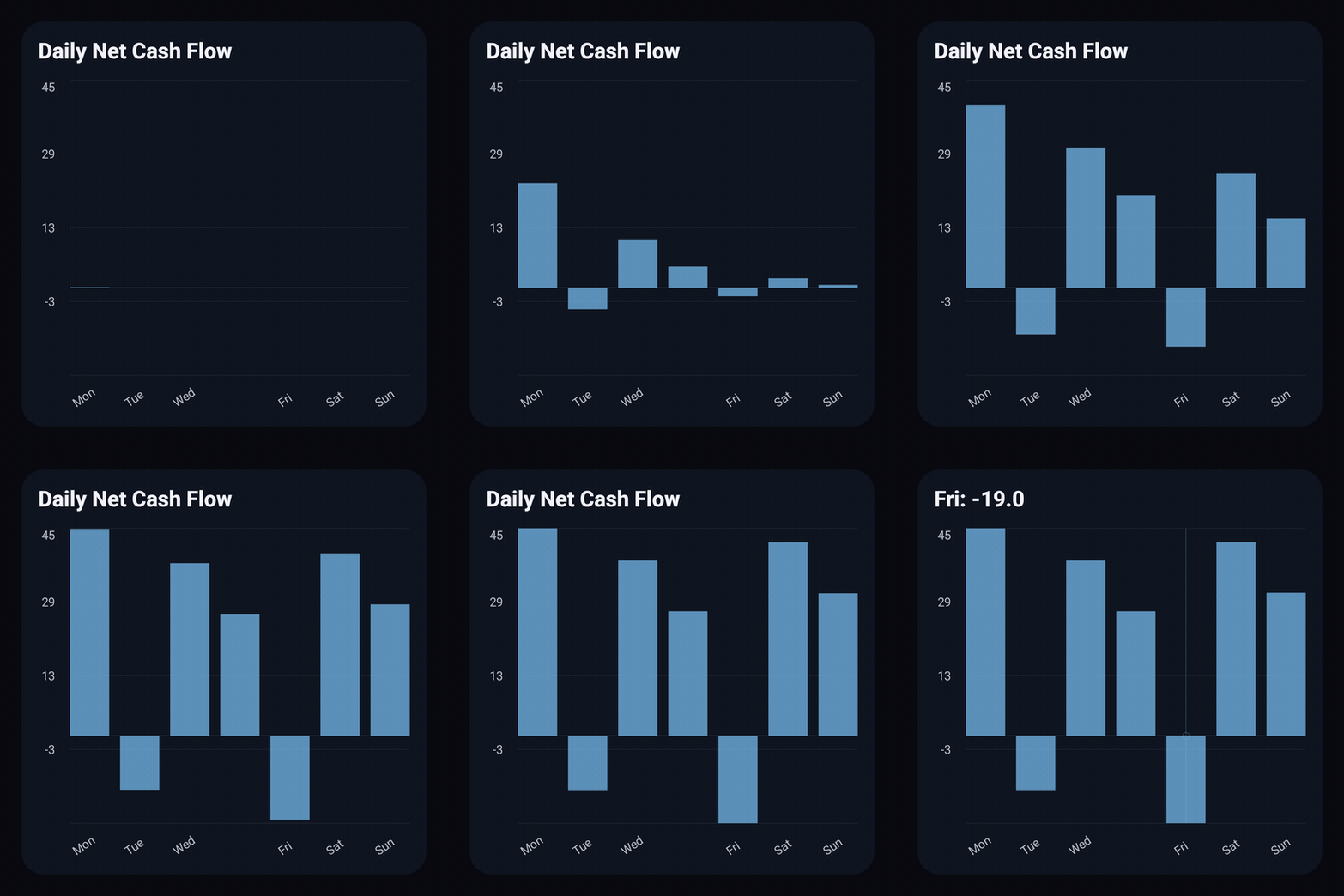
import androidx.compose.runtime.Composable
import io.github.hdcharts.charts.BarChart
import io.github.hdcharts.charts.model.toChartData

@Composable
private fun ShowBar() {
    val data = listOf(45.0, -12.0, 38.0, 27.0, -19.0, 42.0, 31.0).toChartData(
        categories = listOf("Mon", "Tue", "Wed", "Thu", "Fri", "Sat", "Sun"),
        seriesName = "Net cash flow",
    )

    BarChart(data = data, title = "Daily Net Cash Flow")
}
Stacked Bar
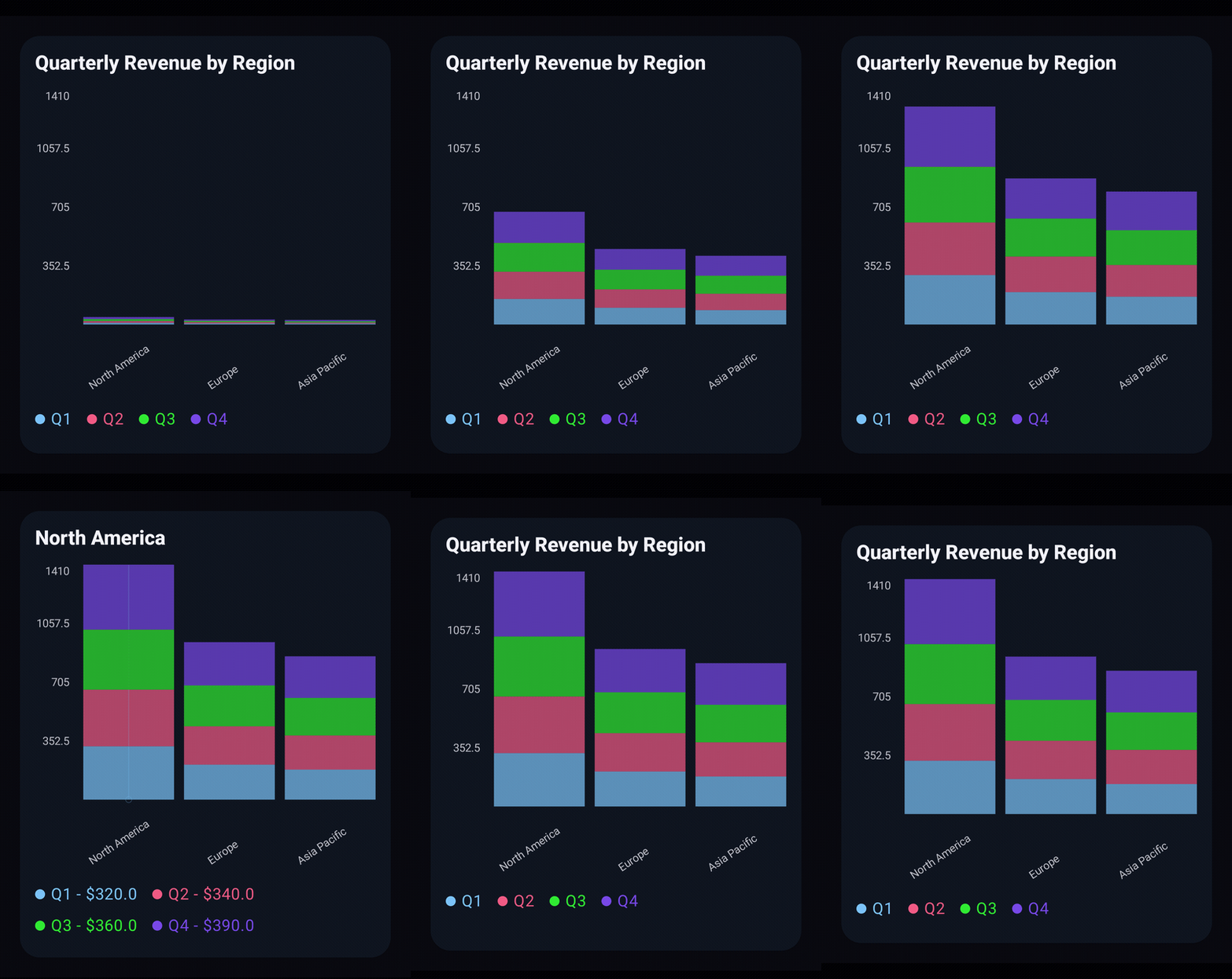
@Composable
private fun ShowStackedBar() {
    val items = listOf(
        "North America" to listOf(320.0, 340.0, 360.0, 390.0),
        "Europe" to listOf(210.0, 230.0, 245.0, 260.0),
        "Asia Pacific" to listOf(180.0, 205.0, 225.0, 250.0),
    )

    val data = items.toChartData(categories = listOf("Q1", "Q2", "Q3", "Q4"))

    StackedBarChart(
        data = data,
        title = "Quarterly Revenue by Region",
    )
}
Histogram
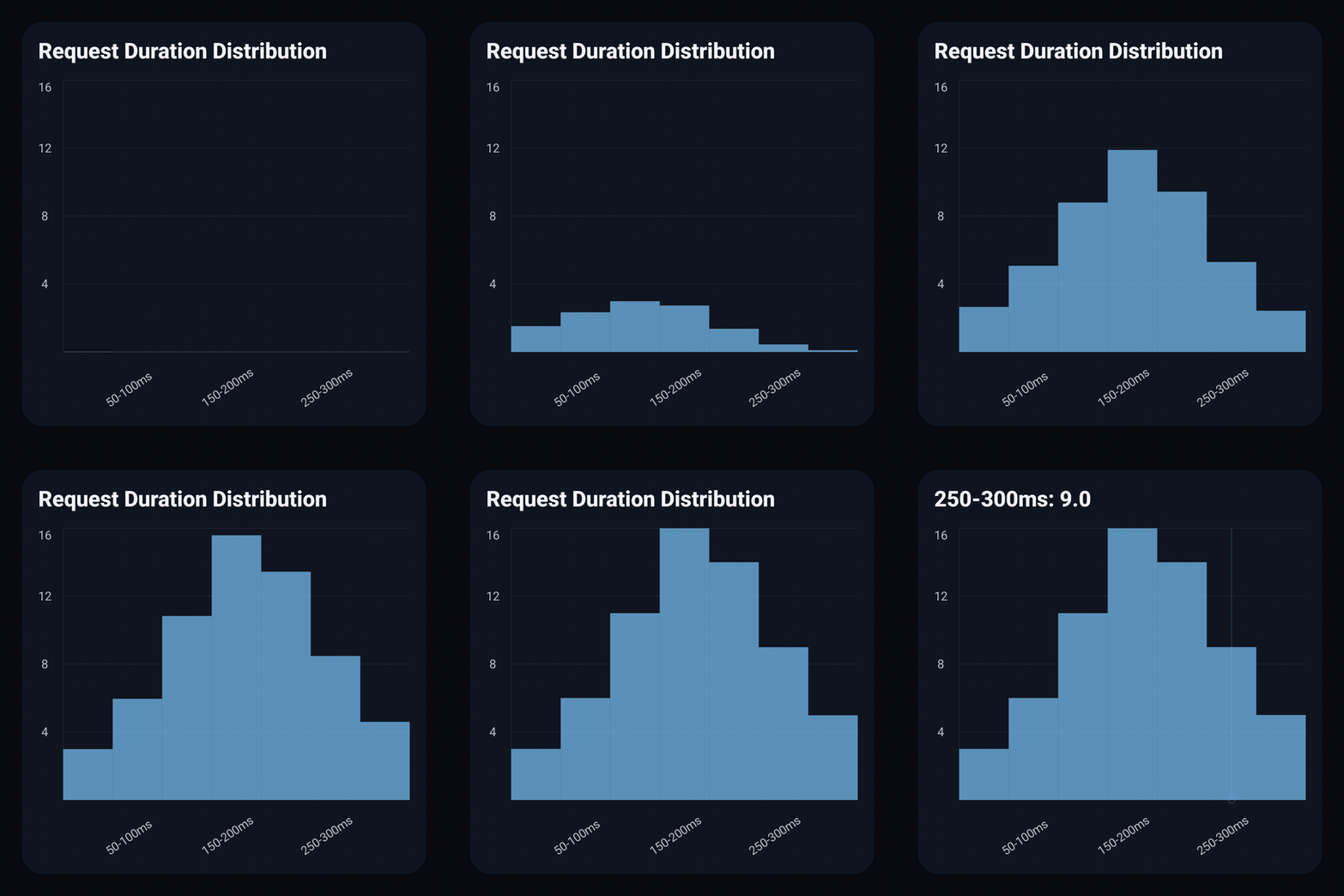
import androidx.compose.runtime.Composable
import androidx.compose.ui.graphics.Color
import io.github.hdcharts.charts.HistogramChart
import io.github.hdcharts.charts.model.toChartData
import io.github.hdcharts.charts.style.HistogramChartDefaults

@Composable
private fun ShowHistogram() {
    val data = listOf(3.0, 6.0, 11.0, 16.0, 14.0, 9.0, 5.0).toChartData(
        categories = listOf("0-50ms", "50-100ms", "100-150ms", "150-200ms", "200-250ms", "250-300ms", "300ms+"),
        seriesName = "Requests",
    )

    HistogramChart(
        data = data,
        title = "Request Duration Distribution",
        style = HistogramChartDefaults.style(
            bars = HistogramChartDefaults.bars(color = Color(0xFF0F766E)),
        ),
    )
}
HistogramChartDefaults.bars(...) keeps zero spacing and a 10.dp minimum width for expanded scrolling. Fit mode preserves every bin, even at subpixel widths, without aggregation.
Stacked Area
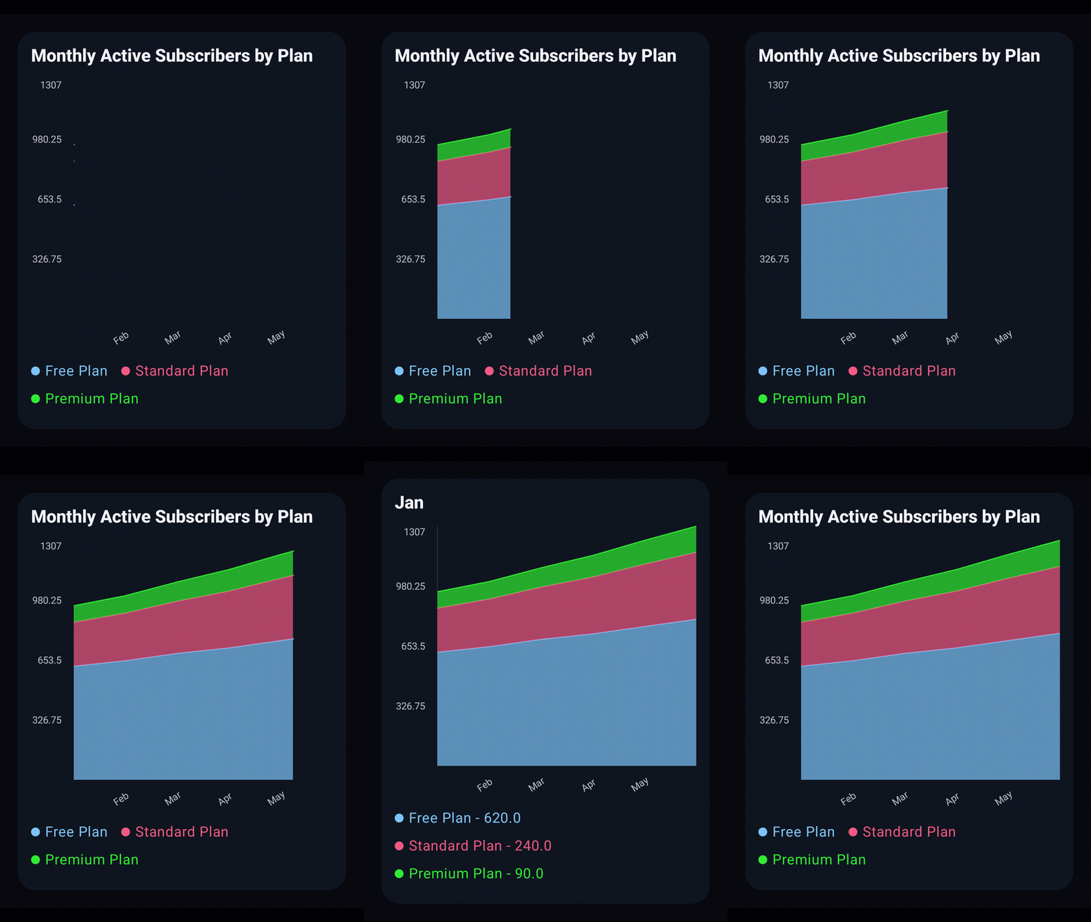
@Composable
private fun ShowStackedArea() {
    val items = listOf(
        "Free Plan" to listOf(620.0, 650.0, 690.0, 720.0, 760.0, 800.0),
        "Standard Plan" to listOf(240.0, 260.0, 285.0, 310.0, 340.0, 365.0),
        "Premium Plan" to listOf(90.0, 95.0, 105.0, 118.0, 130.0, 142.0),
    )

    val data = items.toChartData(categories = listOf("Jan", "Feb", "Mar", "Apr", "May", "Jun"))

    StackedAreaChart(data = data, title = "Monthly Active Subscribers by Plan")
}
Radar
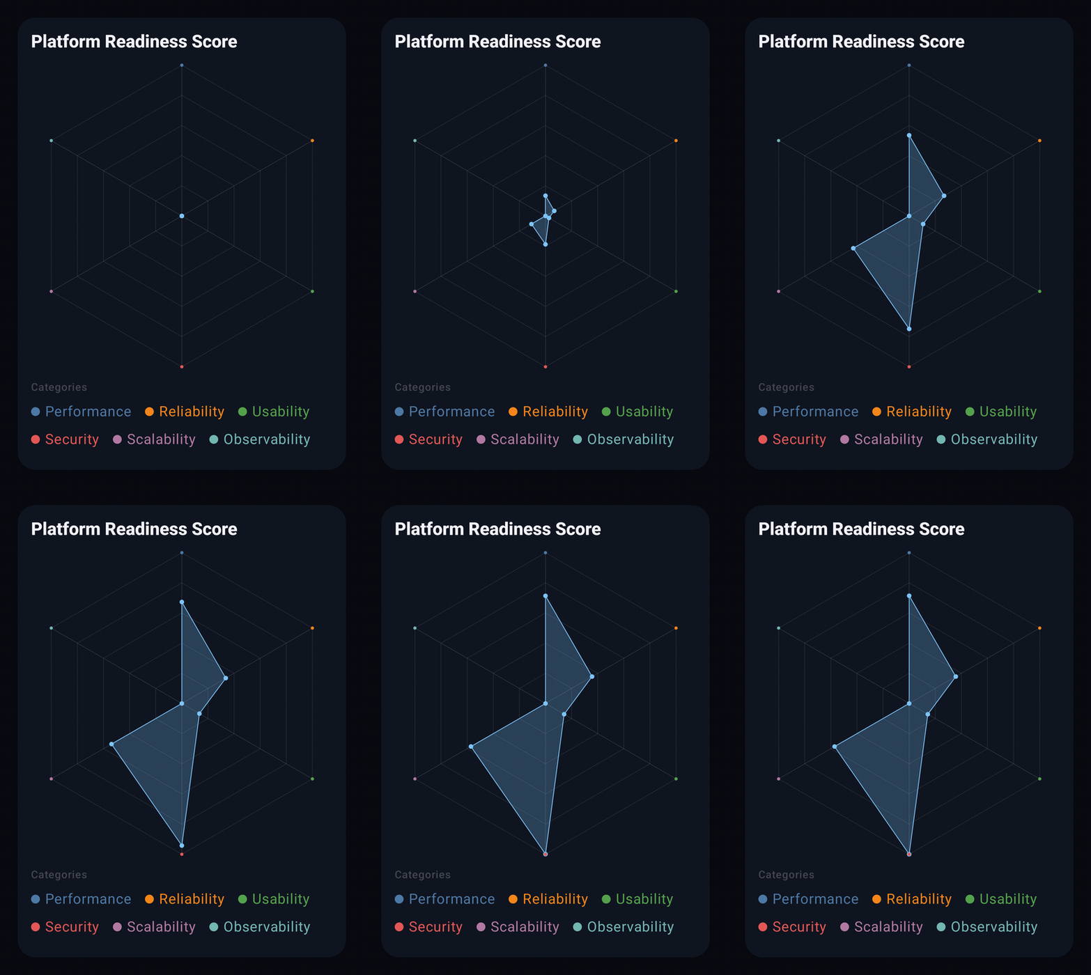
@Composable
private fun ShowRadar() {
    val categories = listOf(
        "Performance",
        "Reliability",
        "Usability",
        "Security",
        "Scalability",
        "Observability"
    )

    val data = listOf(84.0, 79.0, 76.0, 88.0, 82.0, 74.0).toChartData(
        categories = categories,
        seriesName = "Platform Readiness Score",
    )

    RadarChart(data = data, title = "Platform Readiness Score")
}
Style Customization
To customize chart appearance, start from each chart's *ChartDefaults.style(...) factory and override only the fields you need.
import androidx.compose.foundation.background
import androidx.compose.foundation.shape.RoundedCornerShape
import androidx.compose.runtime.Composable
import androidx.compose.ui.Modifier
import androidx.compose.ui.graphics.Color
import androidx.compose.ui.unit.dp
import androidx.compose.ui.unit.sp
import io.github.hdcharts.charts.BarChart
import io.github.hdcharts.charts.model.ChartValueFormatters
import io.github.hdcharts.charts.model.toChartData
import io.github.hdcharts.charts.style.AxisLabelStyle
import io.github.hdcharts.charts.style.BarAxisStyle
import io.github.hdcharts.charts.style.BarBarsStyle
import io.github.hdcharts.charts.style.BarChartDefaults
import io.github.hdcharts.charts.style.BarGridStyle
import io.github.hdcharts.charts.style.BarSelectionLineStyle

@Composable
private fun ShowStyledBar() {
    val data = listOf(45.0, -12.0, 38.0, 27.0, -19.0, 42.0, 31.0).toChartData(
        categories = listOf("Mon", "Tue", "Wed", "Thu", "Fri", "Sat", "Sun"),
        seriesName = "Net cash flow",
    )

    val style = BarChartDefaults.style(
        bars = BarBarsStyle(
            color = Color(0xFF0F766E),
            colors = emptyList(),
            alpha = 0.78f,
            space = 14.dp,
            minBarWidth = 10.dp,
        ),
        grid = BarGridStyle(visible = true, steps = 5, color = Color(0xFF94A3B8), lineWidth = 1.dp),
        selectionLine = BarSelectionLineStyle(visible = true, color = Color(0xFFEA580C), width = 1.dp),
        axis = BarAxisStyle(
            visible = true,
            color = Color.Gray,
            lineWidth = 1.dp,
            yLabels = AxisLabelStyle(visible = true, color = Color.Gray, size = 11.sp, count = 6),
            xLabels = AxisLabelStyle(visible = true, color = Color.Gray, size = 11.sp, count = 6),
        ),
    )

    BarChart(
        data = data,
        modifier = Modifier.background(Color(0xFFF8FAFC), RoundedCornerShape(18.dp)).padding(20.dp),
        title = "Daily Net Cash Flow",
        style = style,
        valueFormatter = ChartValueFormatters.prefix("$"),
    )
}
Chart chrome (background, shape, shadow, and outer padding) lives on the caller-supplied modifier; sizing is fully modifier-driven. The chartContainerStyle block only carries contentPadding and the title text style.
Here valueFormatter adds currency to selected raw values only; Y ticks keep the independent axisValueFormatter default. Titles do not generate labels: omitting categories hides X labels and leaves only the formatted value in selected readouts.
Sizing
The chart composable's modifier is the only sizing control. A bounded modifier becomes a rectangular plot; a one-axis bounded modifier derives a square fallback; a fully unbounded modifier falls back to a 200.dp default.
val dataSet = listOf(42.0, 38.0, 45.0, 51.0, 47.0, 54.0, 49.0).toChartData()

LineChart(
    data = dataSet,
    modifier = Modifier
        .fillMaxWidth()
        .height(260.dp),
)
Surrounding Chrome
Background, shadow, shape, and outer spacing are not applied by the chart. Wrap the chart in any Compose surface to add chrome.
val dataSet = listOf(42.0, 38.0, 45.0, 51.0, 47.0, 54.0, 49.0).toChartData()

Card(modifier = Modifier.padding(16.dp)) {
    LineChart(
        data = dataSet,
        modifier = Modifier
            .fillMaxWidth()
            .height(260.dp),
    )
}
Content Spacing
ChartContainerDefaults.style() returns a ChartContainerStyle with styleTitle and contentPadding. Set contentPadding to change the internal spacing reserved for axes, title, and legend.
val dataSet = listOf(42.0, 38.0, 45.0, 51.0, 47.0, 54.0, 49.0).toChartData()

LineChart(
    data = dataSet,
    modifier = Modifier.fillMaxWidth().height(260.dp),
    style = LineChartDefaults.style(
        chartContainerStyle = ChartContainerDefaults.style(contentPadding = 8.dp),
    ),
)
Selection
Use rememberChartSelection() to hoist selection. The chart calls back into it; you read selectedIndex to drive external UI such as legends or summary cards.
val selection = rememberChartSelection()
val values = listOf(42.0, 38.0, 45.0, 51.0, 47.0, 54.0, 49.0)

LineChart(
    data = values.toChartData(),
    modifier = Modifier.fillMaxWidth().height(260.dp),
    selection = selection,
)

val selected = values.getOrNull(selection.selectedIndex ?: 0)
Text("Selected: $selected")
Animation and Interaction
animateOnStart controls the initial reveal animation; interactionEnabled disables gestures, selection, and zoom controls together. Disable interaction to embed a chart inside a tappable card without conflicts.
val dataSet = listOf(42.0, 38.0, 45.0, 51.0, 47.0, 54.0, 49.0).toChartData()

LineChart(
    data = dataSet,
    modifier = Modifier.fillMaxWidth().height(260.dp),
    animateOnStart = true,
    interactionEnabled = false,
)
Responsive Layout
Compose the chart with any layout, including Row, Column, LazyColumn, or BoxWithConstraints. A bounded modifier is always honored; an unbounded one falls back to the documented defaults.
Column(modifier = Modifier.fillMaxSize().padding(16.dp)) {
    LineChart(
        data = lineData,
        modifier = Modifier.fillMaxWidth().height(220.dp),
    )
    Spacer(modifier = Modifier.height(16.dp))
    BarChart(
        data = barData,
        modifier = Modifier.fillMaxWidth().height(220.dp),
    )
}