Ring Gauge Chart
RingGaugeChart draws each value as its own ring on a half circle, so you can compare several
values on one scale.
Add the gauge module:
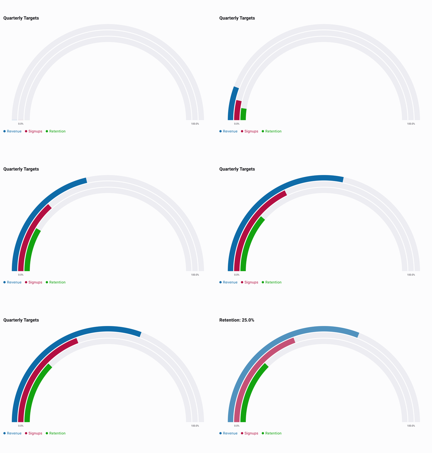
implementation("io.github.hdcharts:gauge:<version>")A ring gauge is one series. Each value fills its ring from the start of the range towards the end, and the first value is the outer ring. Categories are optional and name the rings in the legend and while they are selected; when you pass them, there must be one per value.
The example below is minimal and runs as written. The full source behind the GIF is in
RingGaugeExample.kt.
@Composable
fun ShowRingGauge() {
    val data = listOf(62.0, 39.0, 25.0).toChartData(
        categories = listOf("Revenue", "Signups", "Retention"),
    )

    RingGaugeChart(
        data = data,
        title = "Quarterly Targets",
        selectedValueFormatter = ChartValueFormatters.suffix("%"),
        axisValueFormatter = ChartValueFormatter { value ->
            RingGaugeChartDefaults.axisValueFormatter.format(value) + "%"
        },
    )
}
Range
The arc runs from 0 to 100 by default, which fits percentages. Set your own range for any other
scale, including one below zero:
RingGaugeChart(
    data = listOf(-8.0, 21.0).toChartData(categories = listOf("Outside", "Inside")),
    style = RingGaugeChartDefaults.style(
        range = RingGaugeChartDefaults.range(min = -20.0, max = 40.0),
    ),
    selectedValueFormatter = ChartValueFormatters.suffix("°C"),
    axisValueFormatter = ChartValueFormatter { value ->
        RingGaugeChartDefaults.axisValueFormatter.format(value) + "°C"
    },
)
A value outside the range stops at the nearest end of the arc, and a selected ring still shows its real value in the title.
selectedValueFormatter formats the selected value in the title, and axisValueFormatter formats
the range labels under the ends of the arc.
Rings
Each ring is up to 24.dp wide, with 4.dp between rings. With many rings, they get thinner so the
half circle keeps its shape. A gray track shows the full arc behind each ring.
RingGaugeChart(
    data = data,
    style = RingGaugeChartDefaults.style(
        rings = RingGaugeChartDefaults.rings(
            colors = listOf(Color.Red, Color.Green, Color.Blue),
            width = 16.dp,
        ),
        track = RingGaugeChartDefaults.track(visible = false),
        labels = RingGaugeChartDefaults.labels(visible = false),
    ),
)
Without colors, each ring gets a shade of baseColor. With colors, pass one color per value, in
value order. A color count that does not match the value count shows an error instead of the chart.
Selection
Tap a ring to select it. The other rings fade, and the title shows Category: value, or just the
value when the ring has no category. The legend names the rings and does not change. Tap outside the
rings to clear the selection. Pass selection = rememberChartSelection() to read or set the selected
ring, and interactionEnabled = false to turn off tapping.
Validation
The chart shows an error instead of drawing when:
- The data has no values, or more than one series.
- A value or a range bound is not finite.
- The category count or the color count does not match the value count.
If max is not greater than min, the chart draws the default 0..100 range.