
Histogram Chart
HistogramChart renders binned frequency data as adjacent bars.
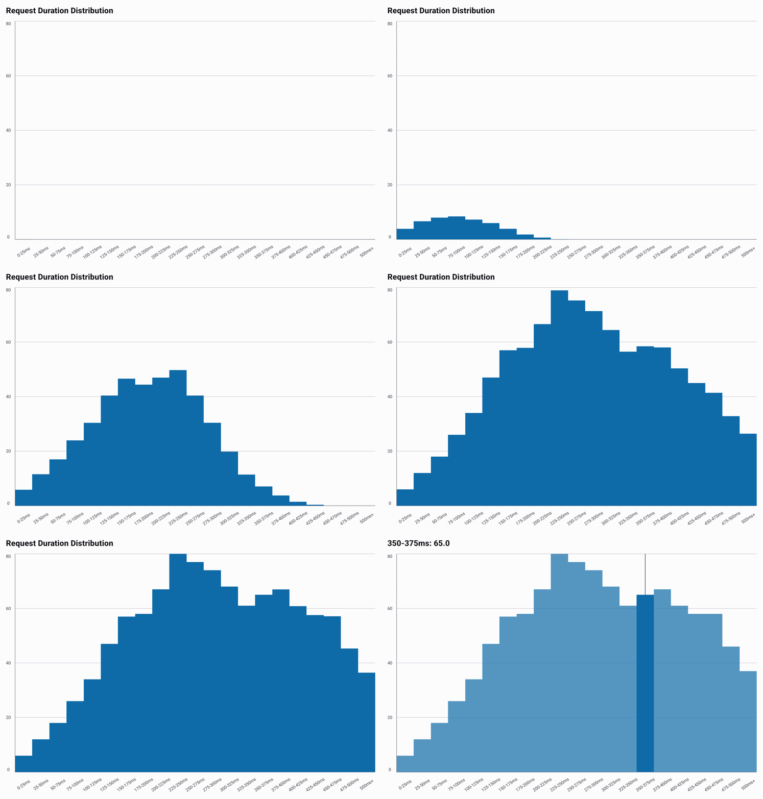
The example below is minimal and runs as written. The GIF above uses a longer generated
distribution; its full source is in
HistogramExample.kt.
@Composable
fun ShowHistogram() {
    val data = listOf(4.0, 18.0, 47.0, 72.0, 58.0, 31.0, 14.0, 6.0).toChartData(
        categories = listOf(
            "0-25ms", "25-50ms", "50-75ms", "75-100ms",
            "100-125ms", "125-150ms", "150-175ms", "175ms+",
        ),
        seriesName = "Request Duration Distribution",
    )

    HistogramChart(data = data, title = "Request Duration Distribution")
}
HistogramChartDefaults.bars(...) keeps zero spacing and a 10.dp minimum width. When the bins do not fit at that width, compact mode merges neighboring bins into wider bars, as BarChart does. Each merged bar shows the average height of its bins, and tapping it selects its middle bin. Expanding the chart scrolls through every bin.
Gradients
Bars take a linear gradient through HistogramChartDefaults.bars(gradient = ...),
covered in Gradients.