
Radar Chart
RadarChart renders one or more series as a polygon across shared categories (spokes).
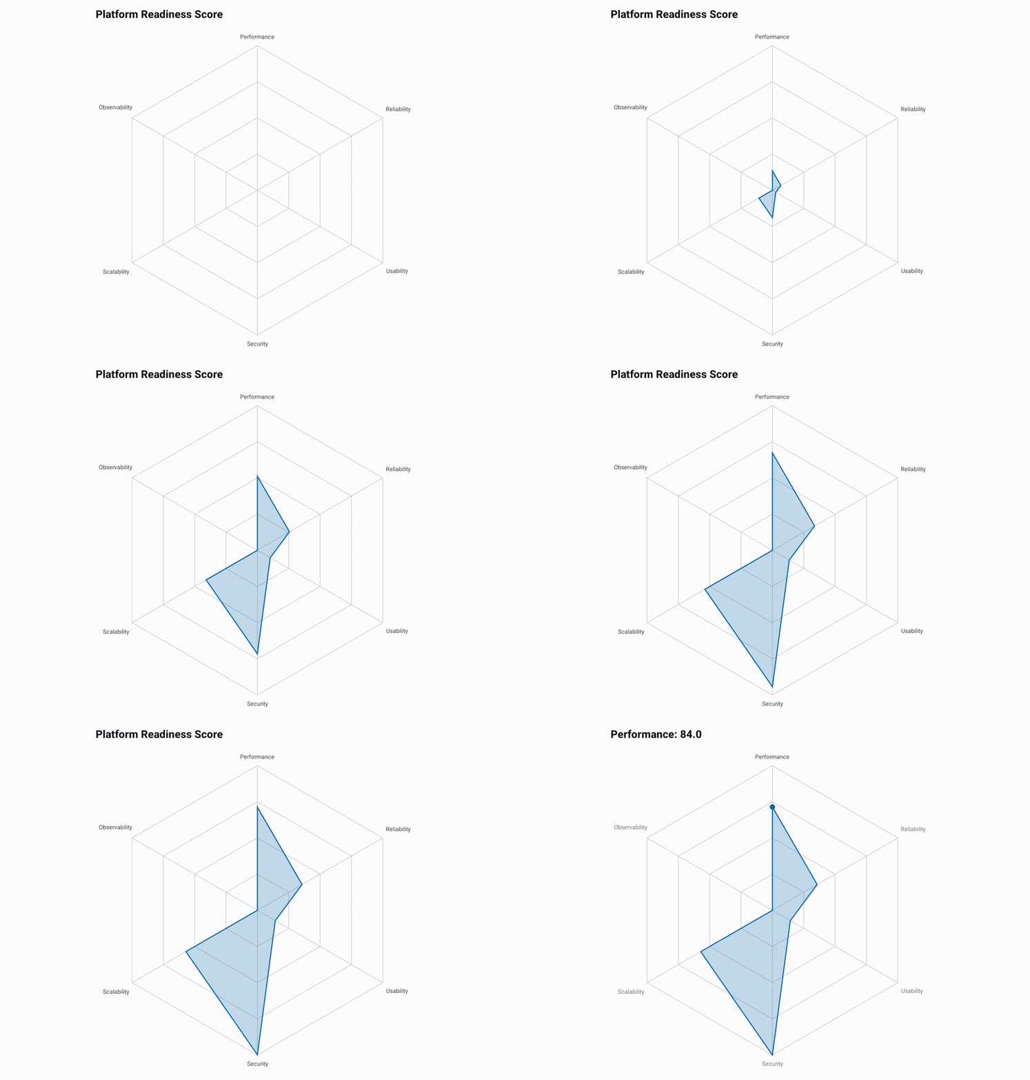
The example below is minimal and runs as written. The full source behind the GIF is in
RadarExample.kt.
@Composable
fun ShowRadar() {
    val data = listOf(84.0, 79.0, 76.0, 88.0, 82.0, 74.0).toChartData(
        categories = listOf(
            "Performance", "Reliability", "Usability",
            "Security", "Scalability", "Observability",
        ),
        seriesName = "Platform Readiness Score",
    )

    RadarChart(data = data, title = "Platform Readiness Score")
}
With more than one series, tap a series outline to focus it, and the other series fade. Where series overlap, tap again to move to the next one. Tap empty space to clear the
focus. Drag around the chart to select a category and read each series' value; the selection stays so
you can read it, and a tap clears it. Pass seriesSelection = rememberChartSelection() to read or set
the focused series. A single series has no legend to read, so the title carries the selected value as
Category: value instead.
Each category name sits at the end of its axis, and the web shrinks to leave room for them. The
chart keeps its full width in a wider box, so a small chart shows a small web and readable labels.
Pass RadarChartDefaults.style(axes = RadarChartDefaults.axes(labelVisible = false)) for a web that
fills the chart instead.