
Pie Chart
PieChart renders proportional data as labeled slices.
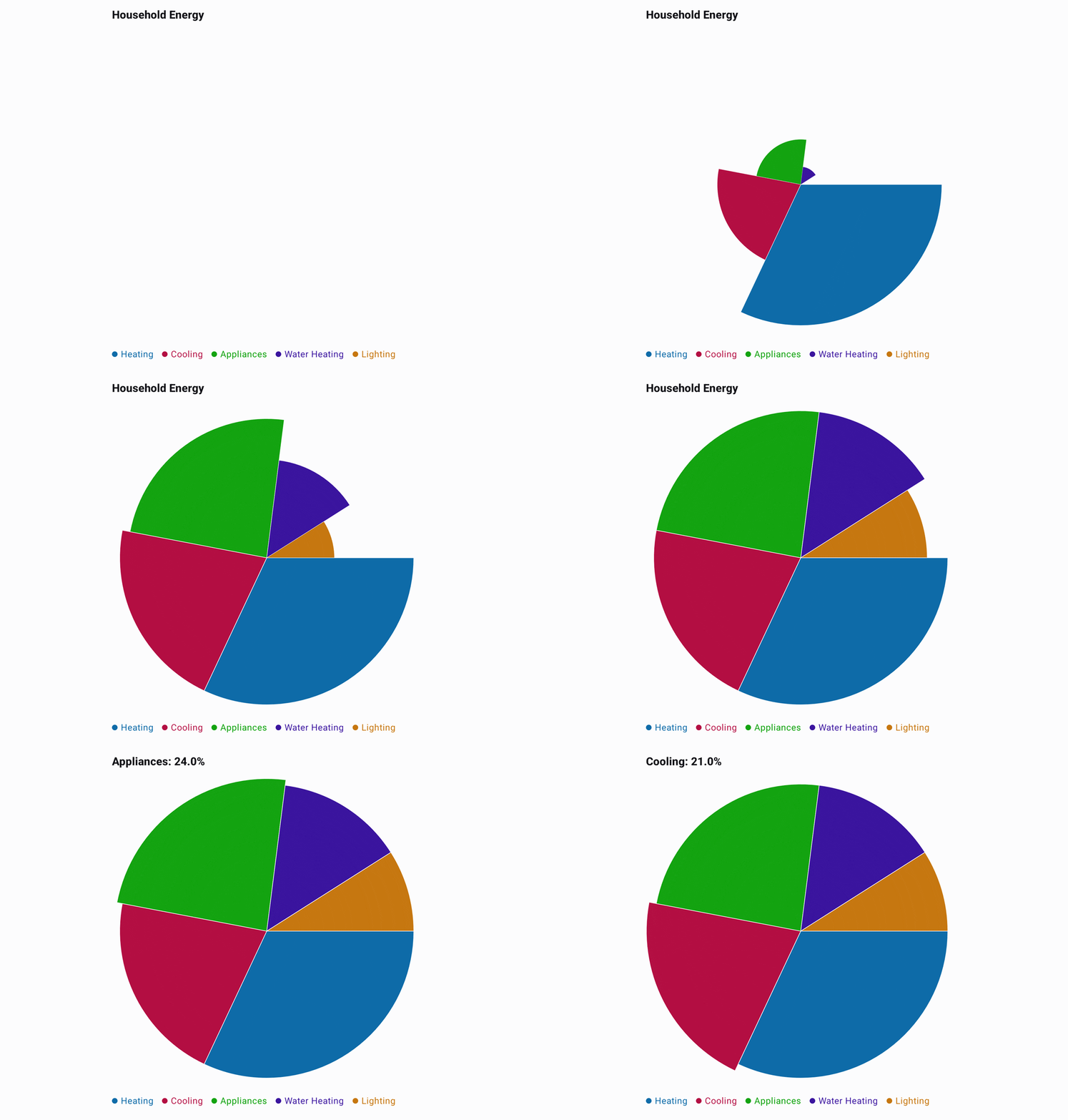
A pie is one series whose values are the slices. Each category is a slice: its label names the slice in the legend and while it is selected. Slice colors come from the style, either as an explicit palette or as shades generated from its base color.
Categories are optional, as they are on every chart. A pie without them draws its slices with no legend, the way a line chart draws with no X-axis labels. With no category and no title, a selected slice shows only its share.
The example below is minimal and runs as written. The full source behind the GIF is in
PieExample.kt.
@Composable
fun ShowPie() {
    val data = listOf(32.0, 21.0, 24.0, 14.0, 9.0).toChartData(
        categories = listOf("Heating", "Cooling", "Appliances", "Water Heating", "Lighting"),
    )

    PieChart(data = data, title = "Household Energy")
}
To give the slices your own colors, set a palette with one color per slice, in slice order:
PieChart(
    data = data,
    style = PieChartDefaults.style(
        slices = PieChartDefaults.slices(
            colors = listOf(Color.Red, Color.Green, Color.Blue, Color.Yellow, Color.Magenta),
        ),
    ),
)
A palette whose count does not match the slice count is reported as an error rather than drawn.
Selected Share
A selected slice shows its category and share of the total in the title, such as Lighting: 42.5%.
selectedValueFormatter formats that share, given in percent from 0 to 100. This one shows whole
percents:
PieChart(
    data = data,
    selectedValueFormatter = ChartValueFormatter { share -> "${share.roundToInt()}%" },
)