
Line Chart
LineChart renders single or multi-series line data and morphs to new values when the
data changes. LiveLineChart renders a live window that slides as new points arrive.
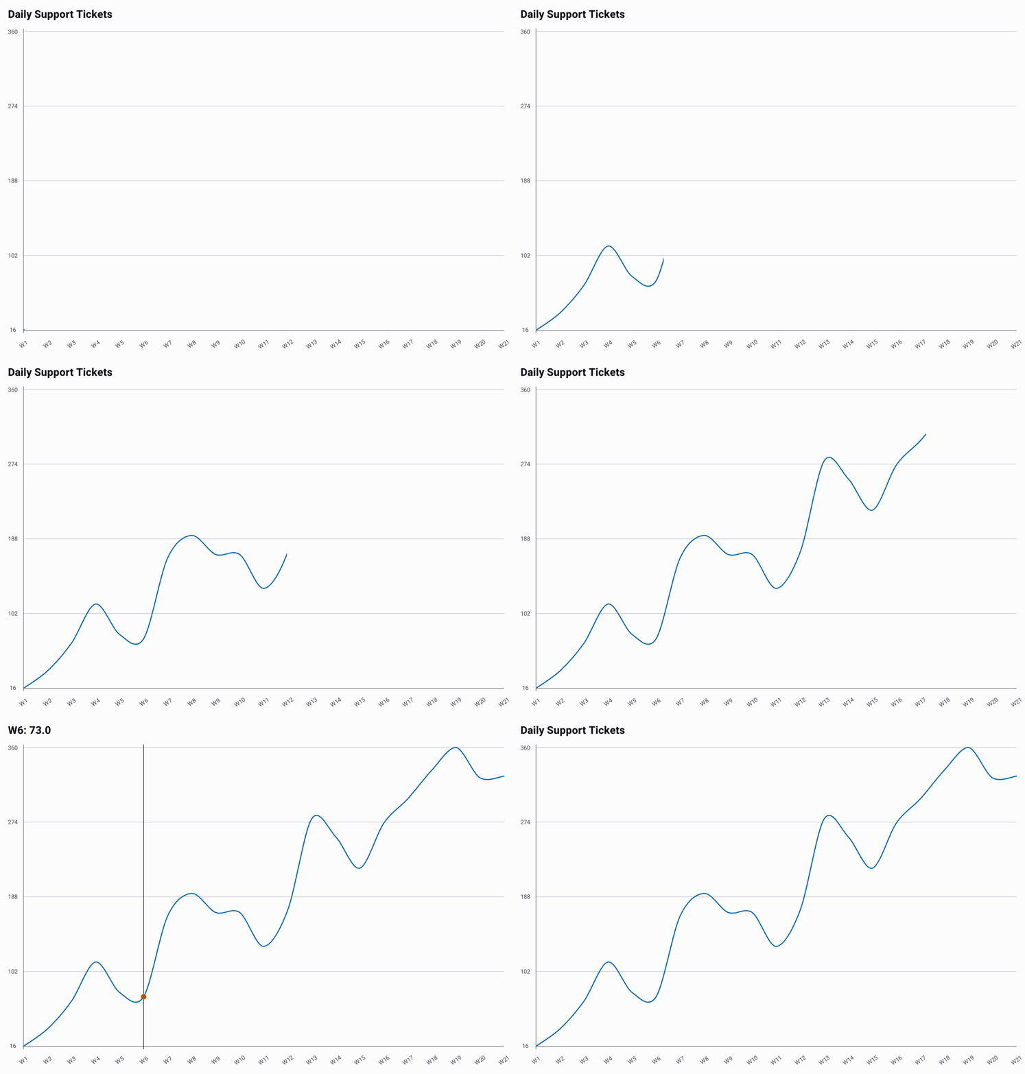
Basic Usage
The example below is minimal and runs as written. The GIF above uses a longer generated
series; its full source is in
LineExample.kt.
@Composable
fun ShowLine() {
    val data = listOf(30.0, 45.0, 38.0, 52.0, 61.0, 49.0, 58.0).toChartData(
        categories = listOf("Mon", "Tue", "Wed", "Thu", "Fri", "Sat", "Sun"),
        seriesName = "Daily Support Tickets",
    )

    LineChart(data = data, title = "Daily Support Tickets")
}
Multi-Series
Pass more than one named series to plot multiple lines on the same chart.
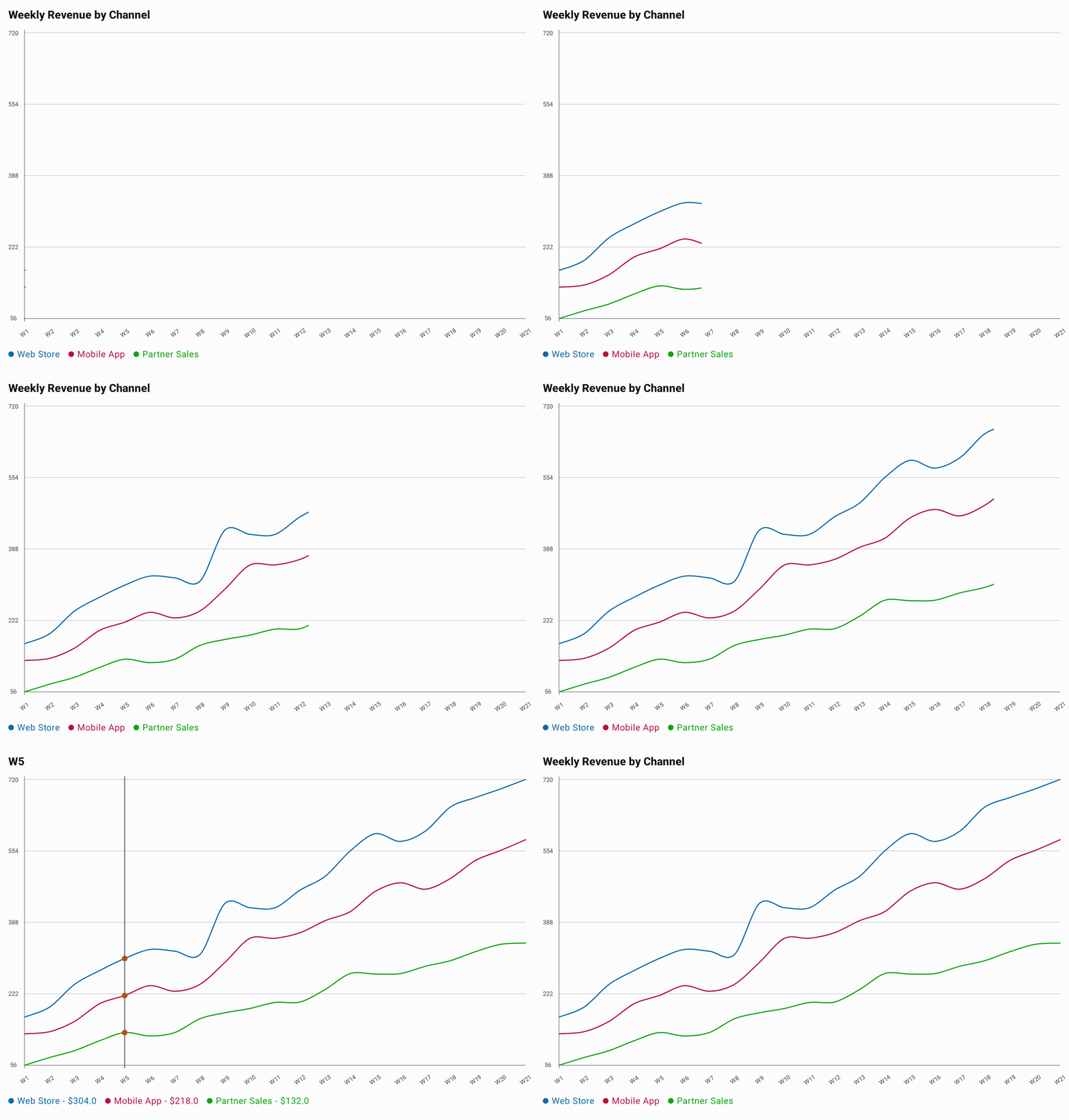
Full source behind the GIF:
MultiLineExample.kt.
@Composable
fun ShowMultiLine() {
    val data = listOf(
        "Web Store" to listOf(180.0, 310.0, 420.0, 560.0, 640.0, 720.0),
        "Mobile App" to listOf(120.0, 240.0, 350.0, 430.0, 520.0, 580.0),
        "Partner Sales" to listOf(60.0, 130.0, 190.0, 240.0, 300.0, 340.0),
    ).toChartData(
        categories = listOf("W1", "W2", "W3", "W4", "W5", "W6"),
    )

    LineChart(
        data = data,
        title = "Weekly Revenue by Channel",
        selectedValueFormatter = ChartValueFormatters.prefix("$"),
    )
}
Fixed Y-Axis Range
By default the Y-axis is derived from the data, which can make small fluctuations look
exaggerated when the axis doesn't start at zero. Set range on LineChartDefaults.style()
to pin min, max, or both, independently of one another; whichever bound you leave null
keeps deriving from the data.
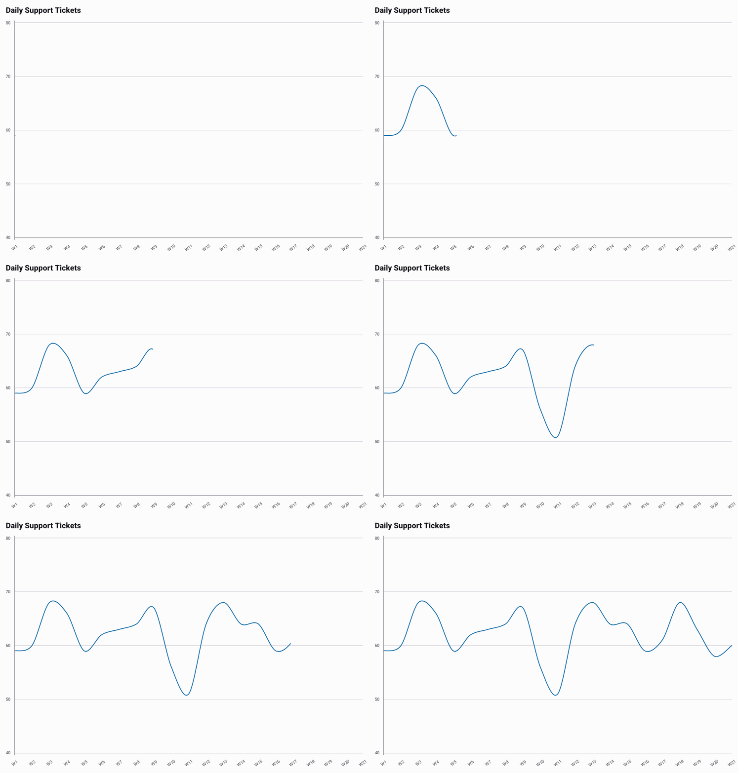
Full source behind the GIF:
LineWithRangeExample.kt.
@Composable
fun ShowLineWithRange() {
    val data = listOf(62.0, 58.0, 65.0, 60.0, 67.0, 59.0, 63.0).toChartData(
        categories = listOf("Mon", "Tue", "Wed", "Thu", "Fri", "Sat", "Sun"),
        seriesName = "Daily Support Tickets",
    )

    LineChart(
        data = data,
        title = "Daily Support Tickets",
        style = LineChartDefaults.style(
            range = LineChartDefaults.range(min = 40.0, max = 80.0),
        ),
    )
}
Gradients
Pass a ChartGradient to LineChartDefaults.line(gradient = ...) to paint the lines with it.
A vertical gradient across the plot colors the line by its value. See
Gradients for details.
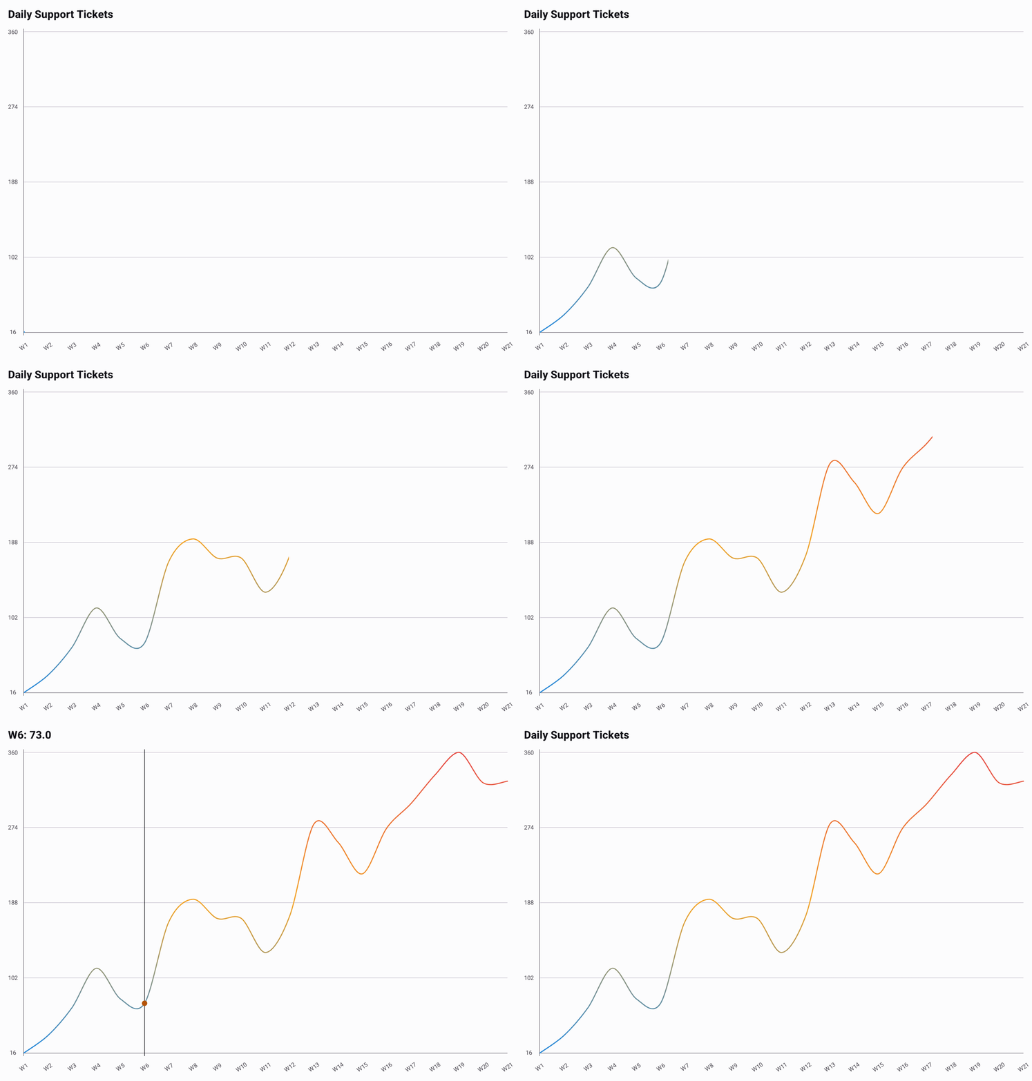
The example below is minimal and runs as written. The GIF above uses a longer generated
series; its full source is in
LineGradientExample.kt.
@Composable
fun ShowGradientLine() {
    val data = listOf(18.0, 24.0, 31.0, 36.0, 29.0, 22.0, 15.0).toChartData(
        categories = listOf("Mon", "Tue", "Wed", "Thu", "Fri", "Sat", "Sun"),
        seriesName = "Daily High",
    )
    // Warm colors at the top of the plot, cool ones at the bottom.
    val gradient = ChartGradients.vertical(
        colors = listOf(Color(0xFFE5484D), Color(0xFFF5A524), Color(0xFF1E89E6)),
        span = GradientSpan.Plot,
    )
    val line = LineChartDefaults.line(gradient = gradient)

    LineChart(
        data = data,
        title = "Daily High (°C)",
        style = LineChartDefaults.style(line = line),
    )
}
We currently recommend gradients for single-series line charts. A multi-series chart shows a
legend, and a gradient can make its lines hard to match to it. Points and selection markers keep
their own colors. LiveLineChart takes the same style. Below, a horizontal gradient colors the
line from its oldest points to its newest as it slides.
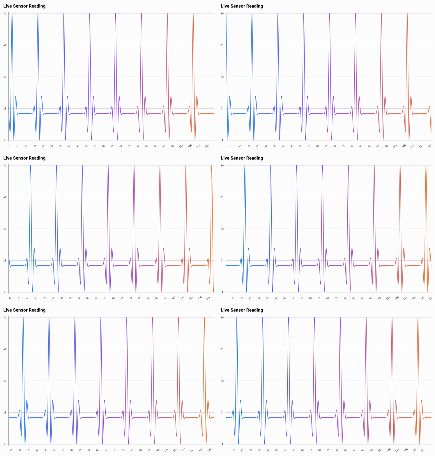
Its full source is in
LiveLineGradientExample.kt.
Morphing Updates
When data changes, LineChart animates the line from its old shape to the new one.
This is the right choice for most charts, including ones with large point counts that
support zoom and scroll.
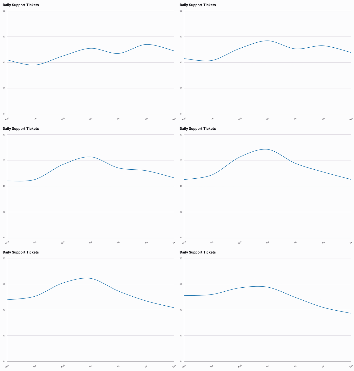
The example below cycles three weeks of the same metric on a timer, with the range
pinned so the axis doesn't jump between weeks — see
Fixed Y-Axis Range above. Full source behind the GIF:
MorphingLineExample.kt.
@Composable
fun ShowMorphingLine() {
    val weeks = listOf(
        listOf(42.0, 38.0, 45.0, 51.0, 47.0, 54.0, 49.0),
        listOf(46.0, 52.0, 68.0, 74.0, 61.0, 50.0, 44.0),
        listOf(58.0, 55.0, 49.0, 43.0, 39.0, 31.0, 28.0),
    )
    var index by remember { mutableIntStateOf(0) }

    LaunchedEffect(Unit) {
        while (true) {
            delay(1400.milliseconds)
            index = (index + 1) % weeks.size
        }
    }

    LineChart(
        data = weeks[index].toChartData(
            categories = listOf("Mon", "Tue", "Wed", "Thu", "Fri", "Sat", "Sun"),
            seriesName = "Daily Support Tickets",
        ),
        title = "Daily Support Tickets",
        style = LineChartDefaults.style(
            range = LineChartDefaults.range(min = 0.0, max = 80.0),
        ),
        animateOnStart = false,
    )
}
Live Line Chart
LiveLineChart is built for live, continuously updating data. New points slide the whole
chart horizontally like a rolling window, and the Y-axis rescales automatically as old
values leave the window. The chart is display-only, so it has no selection.
shiftDuration sets how long each new point takes to slide into place. Match it to how
often data changes.
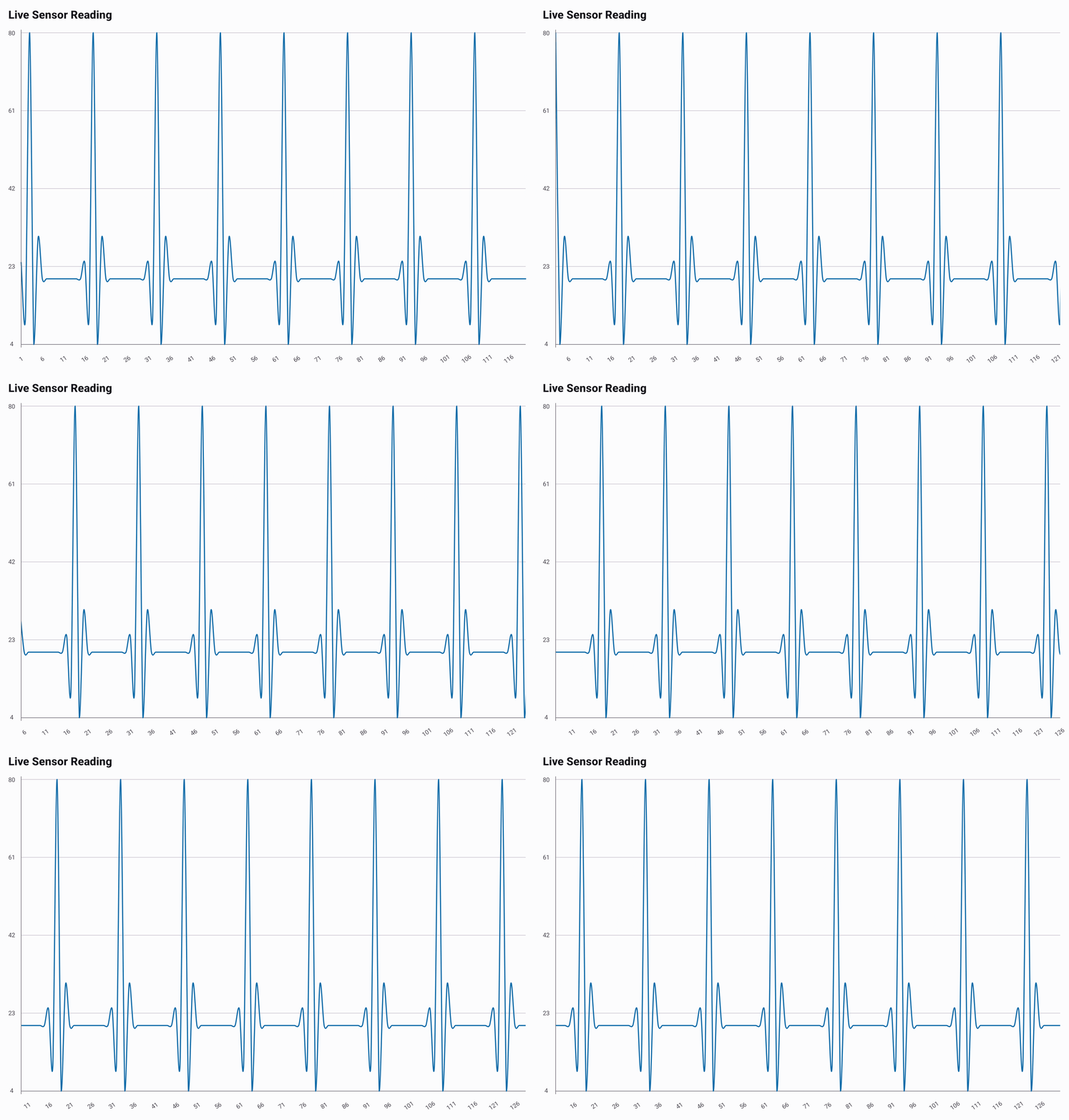
Keep a fixed-size window of values and replace it on every tick. Full source behind the
GIF, including its heartbeat-shaped reading generator, is in
LiveLineExample.kt.
@Composable
fun ShowLiveLine() {
    var values by remember { mutableStateOf(List(120) { 18.0 }) }

    LaunchedEffect(Unit) {
        while (true) {
            delay(150.milliseconds)
            values = values.drop(1) + nextReading()
        }
    }

    LiveLineChart(
        data = values.toChartData(seriesName = "Live Sensor Reading"),
        title = "Live Sensor Reading",
        shiftDuration = 120.milliseconds,
        animateOnStart = false,
    )
}