
Segmented Ring Gauge Chart
Overview
SegmentedRingGaugeChart shows how several contributions fill one fixed capacity. The colored
segments cover the contributions, and the track shows the unused capacity. Use it for progress made
up of named parts, such as daily nutrition; use a pie chart when the parts should represent a whole.
implementation("io.github.hdcharts:gauge:3.1.0")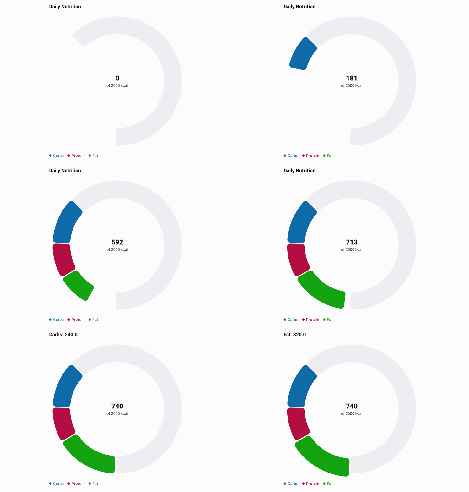
Recording source: SegmentedRingGaugeExample.kt.
Basic Usage
This complete example maps a nutrition domain model to chart data and derives each segment color from the same nutrient record. The chart uses its default center value and legend.
import androidx.compose.runtime.Composable
import androidx.compose.ui.graphics.Color
import io.github.hdcharts.core.model.toChartData
import io.github.hdcharts.gauge.SegmentedRingGaugeChart
import io.github.hdcharts.gauge.SegmentedRingGaugeChartDefaults

private data class Nutrient(
    val name: String,
    val calories: Double,
    val color: Color,
)

@Composable
fun CalorieProgress() {
    val capacity = 2_000.0
    val nutrients =
        listOf(
            Nutrient("Carbohydrates", 240.0, Color(0xFF3B91CC)),
            Nutrient("Protein", 180.0, Color(0xFF1EB157)),
            Nutrient("Fat", 320.0, Color(0xFFE3B713)),
        )
    val data =
        nutrients.toChartData(
            value = { it.calories },
            category = { it.name },
        )

    SegmentedRingGaugeChart(
        data = data,
        capacity = capacity,
        centerSupportingLabel = "of ${capacity.toInt()} kcal",
        style =
            SegmentedRingGaugeChartDefaults.style(
                segments =
                    SegmentedRingGaugeChartDefaults.segments(
                        colors = nutrients.map { it.color },
                    ),
            ),
    )
}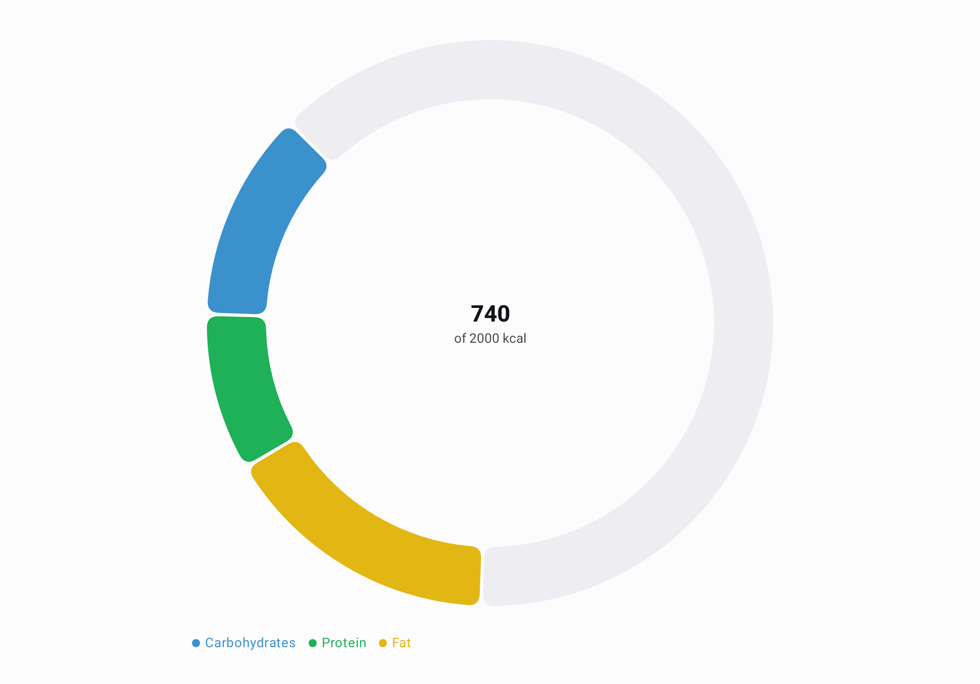
The total is 740 kcal, so the ring fills 740 of its 2,000 kcal capacity. Segment values must be
non-negative, and their sum must not exceed the finite positive capacity.
Capabilities
Capacity and Center Labels
Capacity sets the full ring amount; segment values determine the filled portion.
centerValueFormatter formats the calculated total, while centerLabel explicitly overrides the
displayed primary center text. style.centerLabels controls typography and spacing, not text
content. centerSupportingLabel supplies context such as a unit or capacity. Each capability
composable accepts a ChartData; pass the data mapped in Basic Usage or another ChartData value.
@Composable
fun CapacityAndCenterLabels(data: ChartData) {
    SegmentedRingGaugeChart(
        data = data,
        capacity = 2_000.0,
        centerSupportingLabel = "of 2,000 kcal",
        style =
            SegmentedRingGaugeChartDefaults.style(
                centerLabels =
                    SegmentedRingGaugeChartDefaults.centerLabels(
                        value = TextStyle(fontSize = 32.sp),
                        supporting = TextStyle(fontSize = 14.sp),
                        spacing = 6.dp,
                    ),
            ),
    )
}
Selection
Tapping a segment selects it, enlarges it, and shows its category and value in the chart title.
User selections clear after three seconds; another segment tap renews the timeout. Tapping the
track or center clears the selection. This excerpt reuses data from Basic Usage and keeps the
default user interaction enabled.
@Composable
fun SelectableNutrition(data: ChartData) {
    val selection = rememberChartSelection()

    SegmentedRingGaugeChart(
        data = data,
        capacity = 2_000.0,
        selection = selection,
    )
}
The selection is hoisted, so application UI can also observe or clear it. Set
interactionEnabled = false when a selection should be controlled by the application and remain
persistent; the chart then does not handle selection taps or start the auto-clear timeout.
Segment Styling
Set ring thickness, spacing, and corner radius through segments; the width may shrink to preserve
the center hole in a small layout. The track represents only unused capacity. This excerpt reuses
data from Basic Usage.
@Composable
fun StyledNutrition(data: ChartData) {
    SegmentedRingGaugeChart(
        data = data,
        capacity = 2_000.0,
        style =
            SegmentedRingGaugeChartDefaults.style(
                segments =
                    SegmentedRingGaugeChartDefaults.segments(
                        width = 24.dp,
                        spacing = 5.dp,
                        cornerRadius = 8.dp,
                    ),
                track = SegmentedRingGaugeChartDefaults.track(color = Color(0xFFE5E7EB)),
            ),
    )
}
Start Position and Direction
Choose the boundary before the first segment and the direction segments advance from that point.
The defaults are TopLeft and CounterClockwise. This excerpt reuses data from Basic Usage.
@Composable
fun ReversedNutrition(data: ChartData) {
    SegmentedRingGaugeChart(
        data = data,
        capacity = 2_000.0,
        style =
            SegmentedRingGaugeChartDefaults.style(
                segments =
                    SegmentedRingGaugeChartDefaults.segments(
                        startPosition = SegmentedRingGaugeStartPosition.Top,
                        direction = SegmentedRingGaugeDirection.Clockwise,
                    ),
            ),
    )
}